
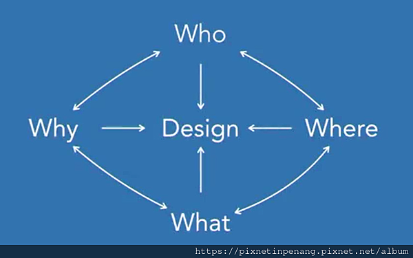
The 4 questions for every dashboard : Not a linear process
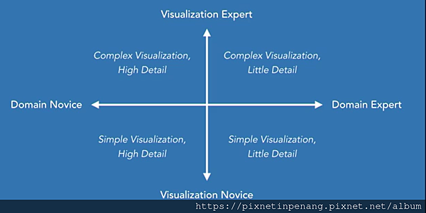
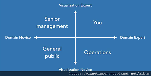
1. Who is the audience
i. What do they know already?
ii. How much detail to include or exclude?
- Examples :
a. Your team
- Consider the visualizations for explanations
- Simple chart types
- Understand the data
b. Your department
- Add more explanations and terminology
- Explain the data
c. Senior management
- Much higher level, more data from more sources
- Not as much detail
- Ability to drill down
- Explanations on terminology and data
d. Operational
- Real-time data
- Filters and interactions to drill down
e. General Public
- Carefully explain the data and what's important
- Consider chart type and explanations
2. Where will the dashboard be viewed? Size and Level of interaction
i. Large or Small screen?
ii. Print, Mobile, or desktop?
- Examples :
a. Desktop/Laptop
- Greatest freedom
- Large amount of space
- Lots of interaction
- Filters, parameters, actions
b. Tablet/Mobile
- Smaller maximum size
- Consider the orientation
- Scrolling v.s. single screen
c. Print/TV Display
- Can't interact
- Everything needs to be on screen
- Large fonts and labels
- How close or far away does it need to be seen?
3. Why are you sharing the data? What is the purpose?
i. Is it to form?
- Informative : Built for information
- All about information
- Present the data to easily find answers
- Stil provide some interaction
- More focused on a single question
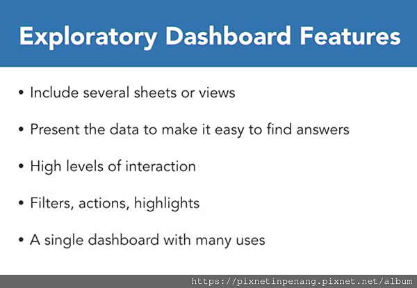
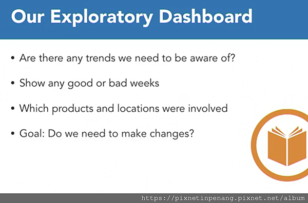
ii. Is it to explore?
- Built for discovery
- All about discovery
- Present data to easily find answers
- High levels of interaction
- Filters, actions and highlights
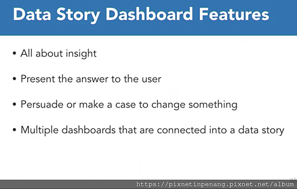
iii. Is it to explain?
- Built for insight
- All about insight
- Presenting the answer of the user
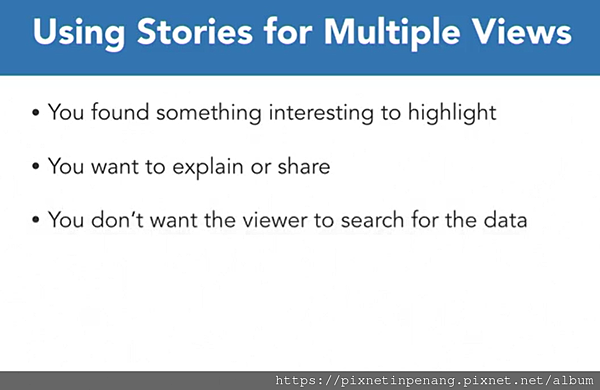
- Show the interesting thing we have found
- Persuade or make the case of change something
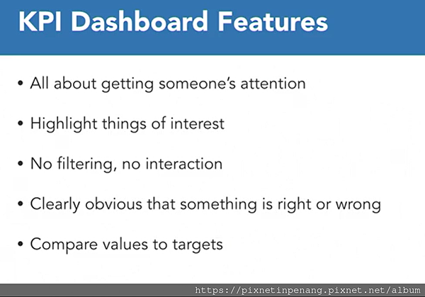
iv. Is it to measure a goal?
- Key performance indicator (KPI) : Built for attention
- All about getting someone's attention
- Highlighting things of interest
- No filtering, no interaction
- Clearly obviously that something is right or wrong
4. What information will you show?
i. What question will it answer?
ii. What do you want the audience to take away?
- Questions
- What elements will help?
- What data do we need to display?
- High or low level of detail?
- Live or extracted data?
- How many filters do we need?
- What do we need to include?
- What should we exclude?
- What is the minimum viable information required?
==== Dashboard Structure ====
Create a basic dashboard

Size your dashboard
1. Amount of Dashboard Space
- How many elements
- Layout options
2. Location of the Dashboard
Tiled vs Float
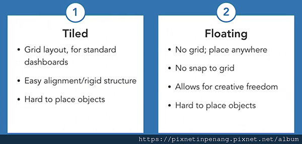
- Don't mix a tile and a float
How to use layout containers
- Layout containers are useful for designing your dashboard.
- Create layout container
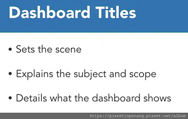
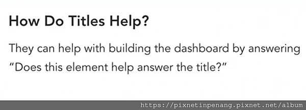
Titles on your dashboard
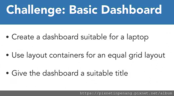
Challenge : Create a basic dashboard
==== Dashboard Component ====
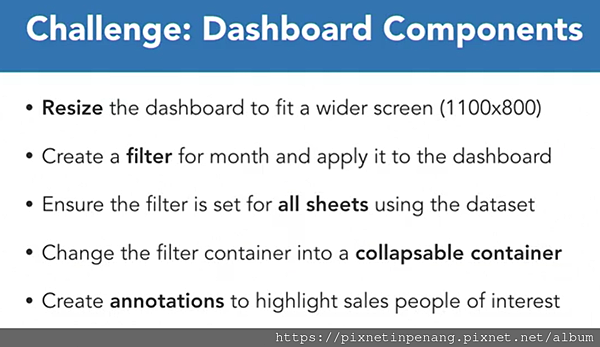
Apply filters across sheets

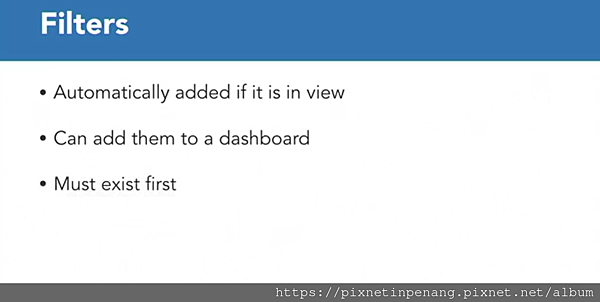
1. How to make filters apply to some sheets, but not others.
2. Where to place filters
Highlight data with annotations
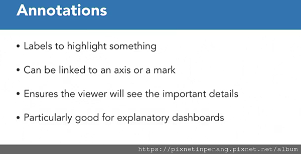
- Point annotation refers to axis, not data, so filters changing cannot impact its.
Additional information and help
- Instrucitons on how to read the dashboard or where the data came from.
- Help buttons or informational buttons as to not take up valuable space
Collapsible containers to show or hide elements

Challenge
==== Dashboard Design Elements ====
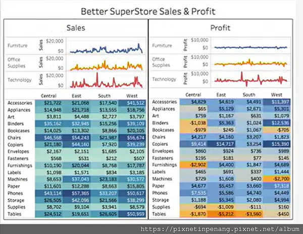
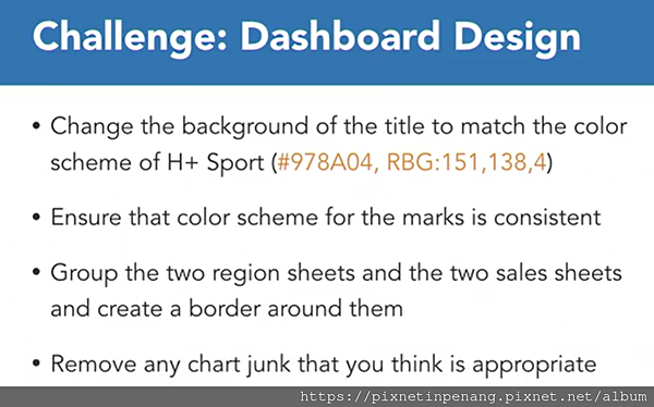
Colors :easy to get wrong, too much color adds to confusion
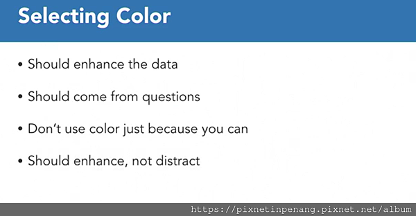
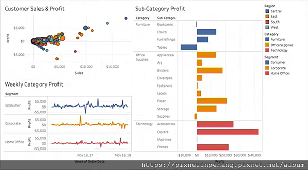
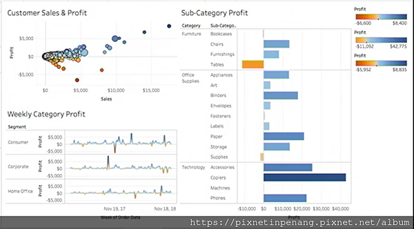
- Better : Blue for positve profit, Orange for negative profit
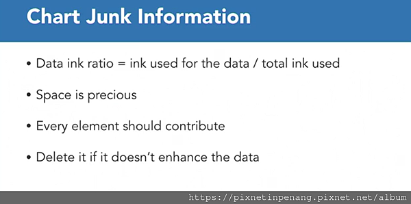
Remove chart junk
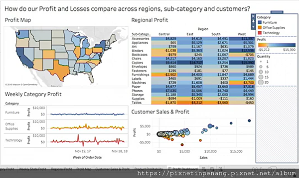
1. Remove the map title
2. Remove line chart title, axis title/header
...
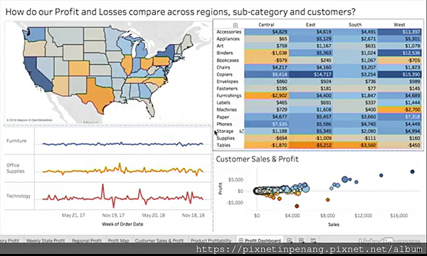
Visually Group elements with borders
Challenge
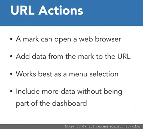
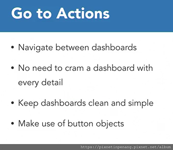
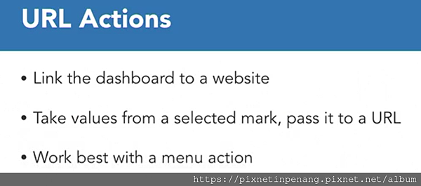
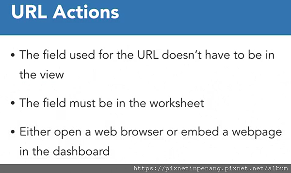
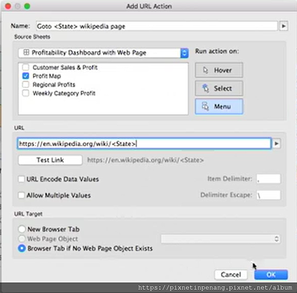
Add interaction with actions :
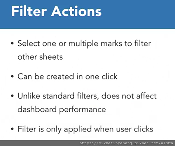
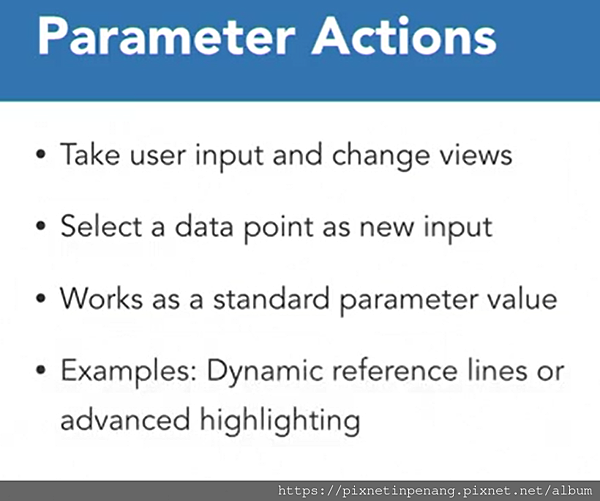
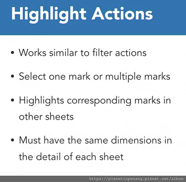
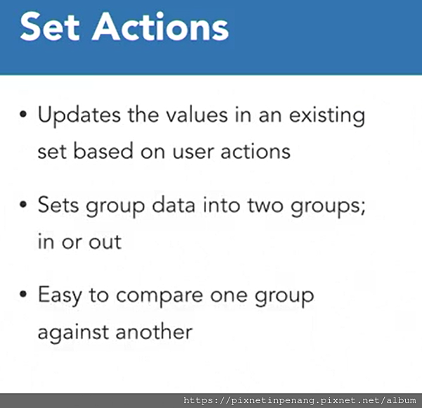
Filter Actions :
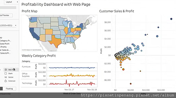
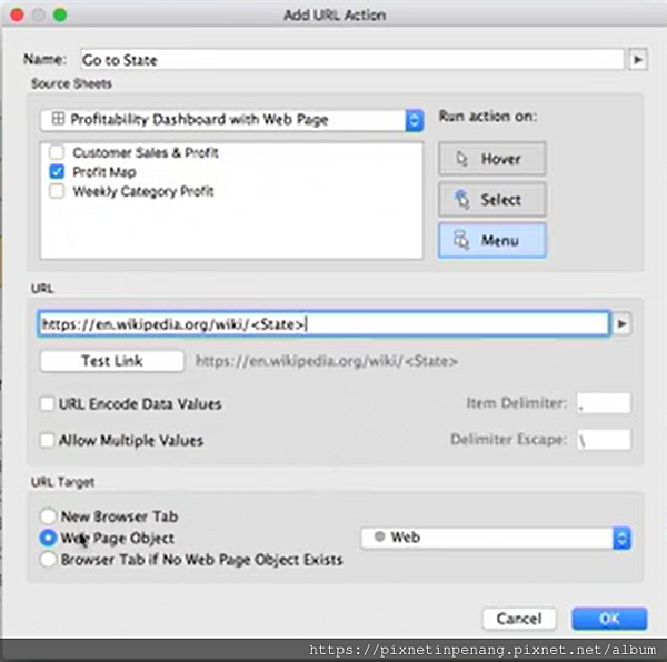
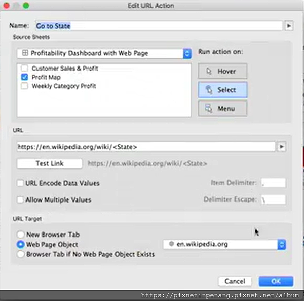
URL :
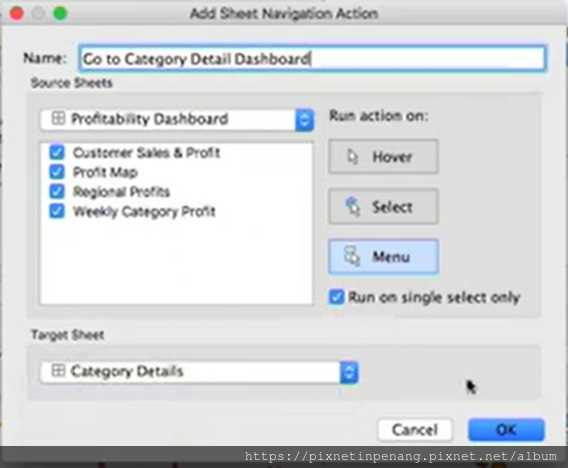
Go to Sheet :
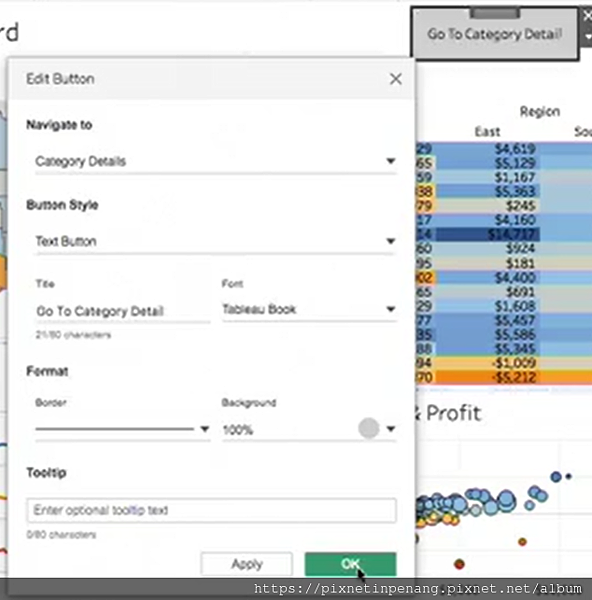
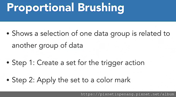
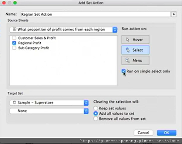
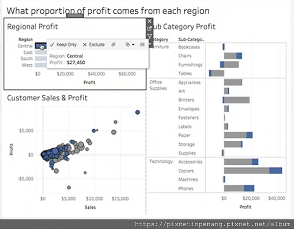
Proportional brushing using set actions
Asymmetric drill down using set actions
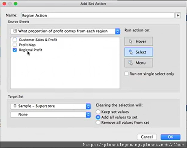
Challenge :
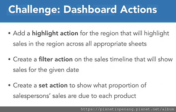
==== Using Stories to Make Dashboard ====
Data viz vs data stories
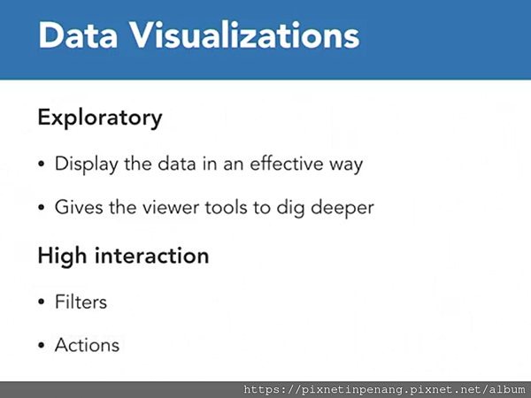
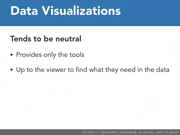
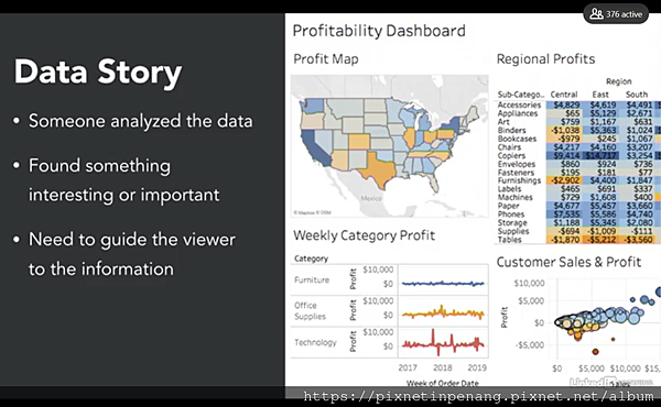
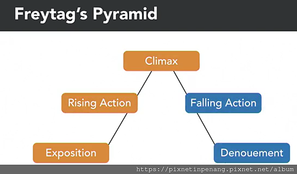
Narrative structure
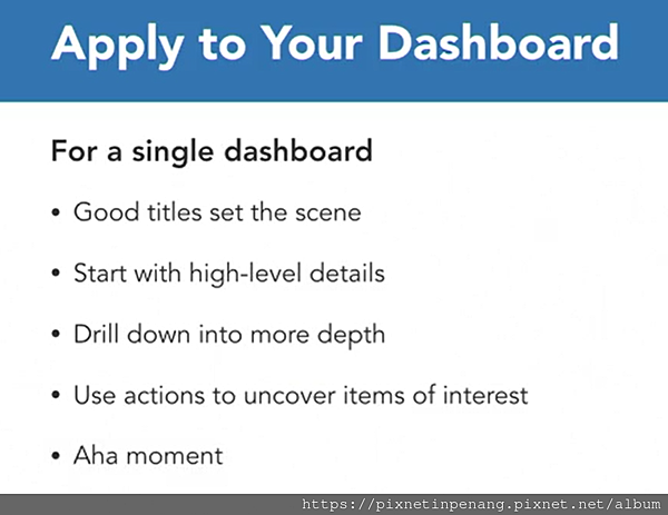
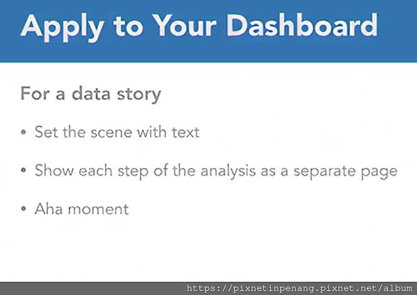
Big Stories
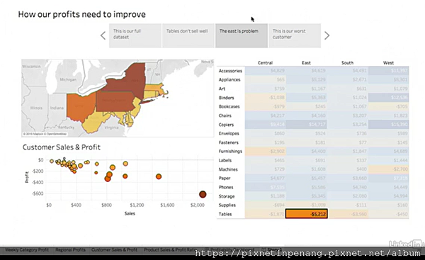
Small Stories
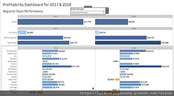
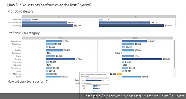
==== One Dataset : Five Dashboards ====
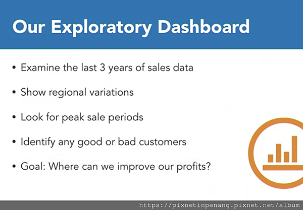
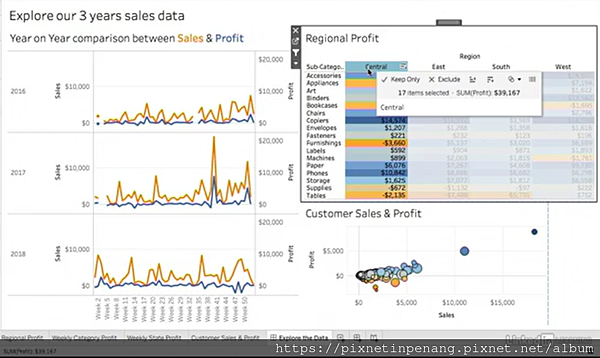
- Look for Regional Variation
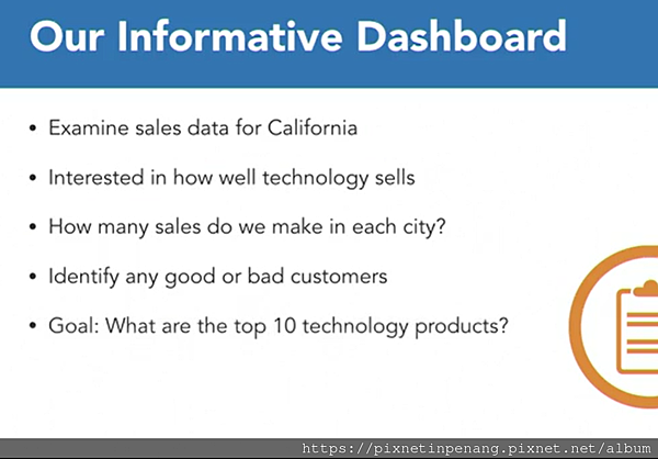
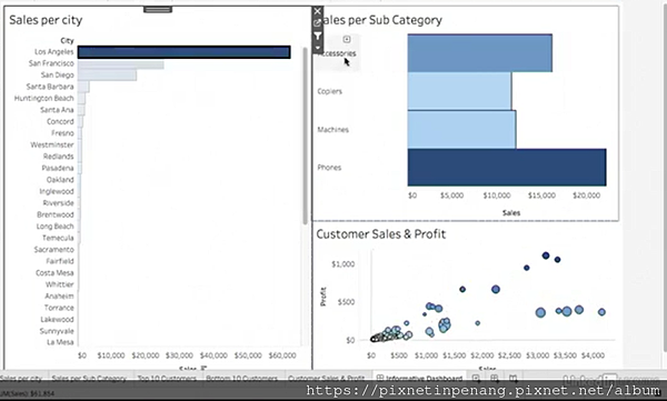
Build an informative dashboard
Build a data story : For changes
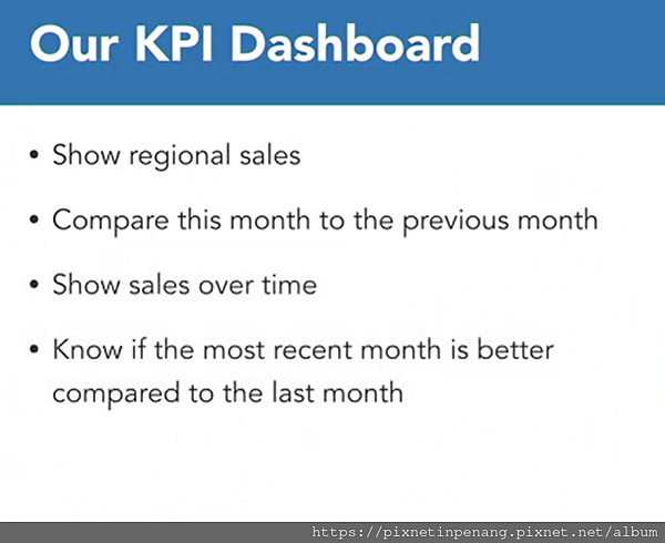
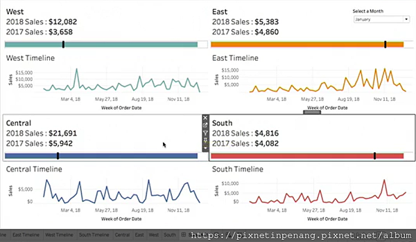
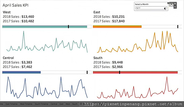
Build a KPI dashboard
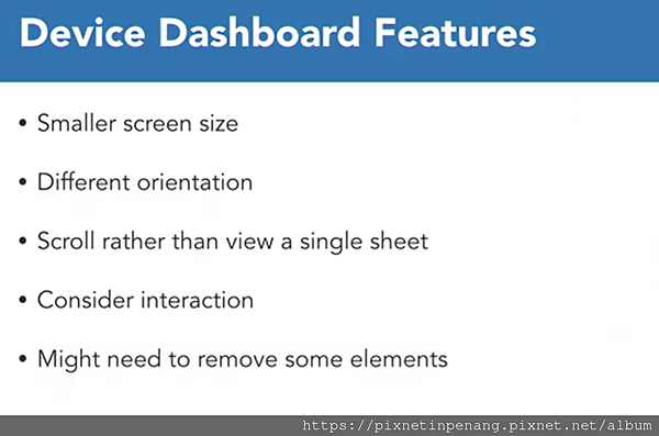
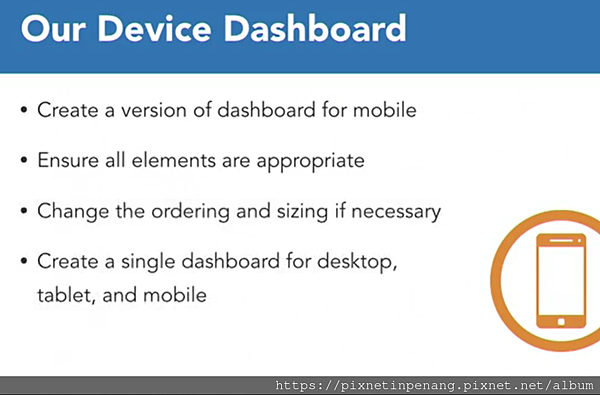
Design for tablets and mobile
Next
- Mar 07 Sun 2021 14:13
[Data Visualization] Creating Interactive Tableau Dashboards
close
全站熱搜
 留言列表
留言列表
禁止留言


 留言列表
留言列表


